Best Words Case Study
Project Goals
The client was looking to update their logo for their freelance writing business. He was looking for something professional and easily recognizable for his website.
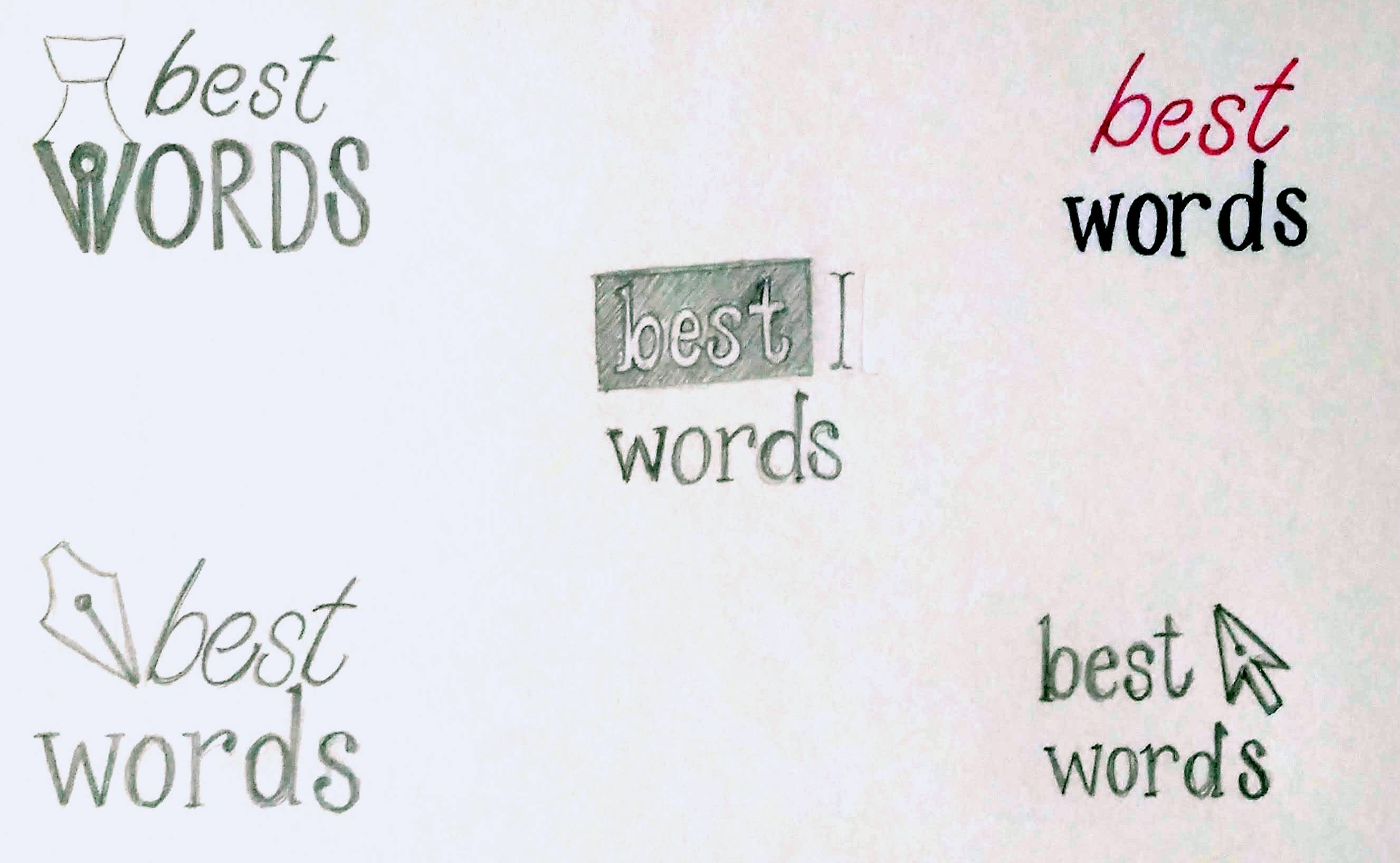
Design Sketches
I started by drafting some rough sketches of logos to share with the client. In addition to having the business name, I wanted to include some common writing symbols so that others would instantly associate writing with the client's business. Some of those symbols included a fountain pen nib, a computer cursor, a text cursor, highlighted text, and the infamous red pen often associated with editing.
Font Selection
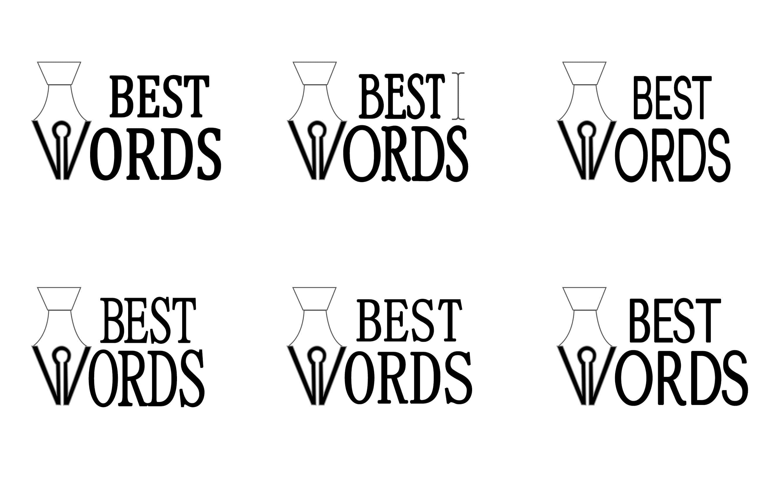
After showing the sketches to the client and gathering feedback, we selected the design implementing the fountain pen nib that also served as the 'W' in Words. Font selection can really change the overall tone of a logo, so I created some logo mock-ups with various font options. The client also liked having the more modern text cursor as part of the design to symbolize a joining of both old and new writing methods. I included one possibility of bringing that element into the design.
Final Design
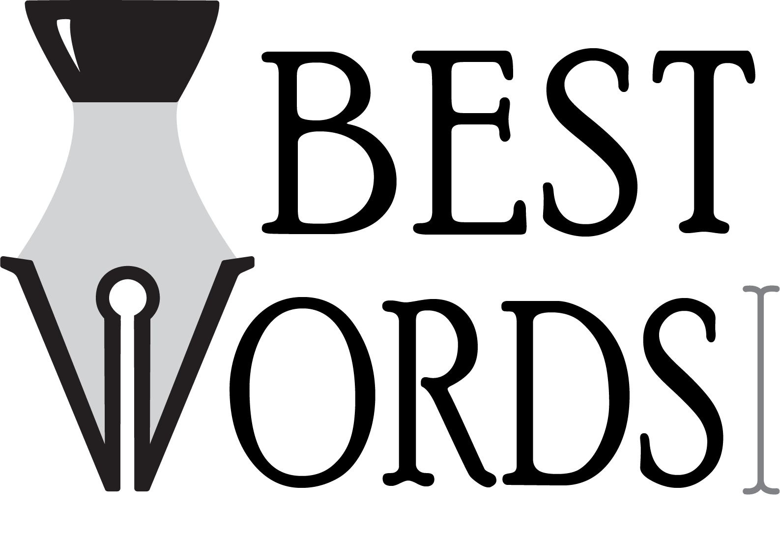
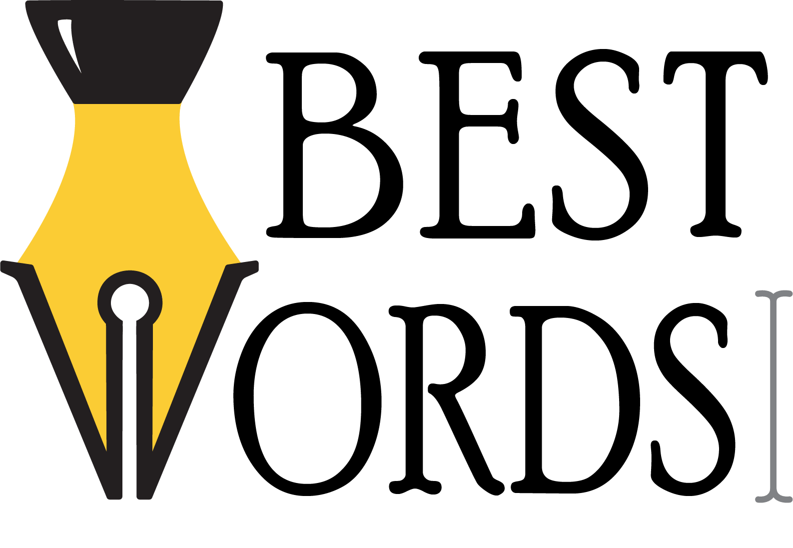
With a font selected and another round of feedback, a final design was created. The end result brought together all the elements the client was looking for - a more professional logo that would clearly associate him with his writing and editing work. The fountain pen nib and computer text cursor allow a wide demographic to recognize symbols associated with writing and editing. To offer the greatest amount of flexibility for using the logo, I provided the client with multiple versions of the logo. This included both raster and vector file formats in addition to a color and grayscale version (to ensure proper contrast even without color). I also included a favicon of the fountain pen nib with the 'W' that could be used to identify his business even from the browser tab.