Coffee Nook Case Study
Project Goals
Create a brand and identity for a new local coffee shop, The Coffee Nook. The project deliverables will include:
- color scheme
- typescale
- brand images
- logo
- icon pair
- social media header
- brand style guide
- landing page
The Coffee Nook is a coffee shop aiming to provide a gathering space for ALL members of the community to come together over coffee. Their mission statement is:
To create a warm, inviting environment - one cup of coffee at a time - where friends, family, neighbors, and strangers can gather together as a community.
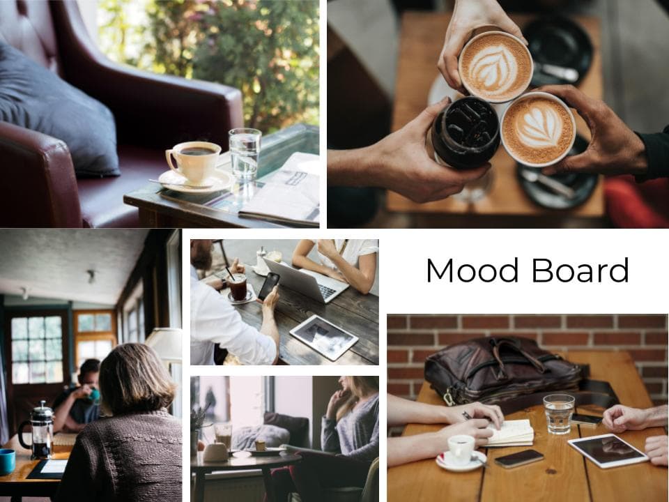
Mood Board
To better establish the look and feel of The Coffee Nook, I gathered images to create a mood board that fit the identity of the coffee shop. Overall the brand personality was sincere, welcoming, and accepting. I wanted to create a look and feel that would support that personality.
I looked for images that showed a warm environment. I also wanted to find images that showed people meeting and making a connection. Once these images were gathered, I could begin to form a more cohesive identity for The Coffee Nook through a color scheme, typescale, and logo.
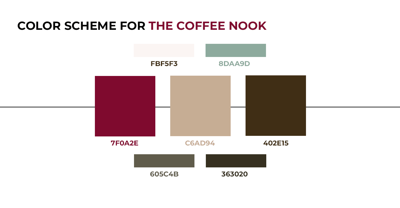
Color Scheme
For the color scheme, I wanted to find colors that were warm, inviting, and reminiscent of coffee. I chose a rich, deep brown color as an accent to reference the color of coffee. To complement that, I also selected a lighter tan color that could be used for icons. Overall, the main color is a deep, scarlet red that will still carry the warm, inviting atmosphere, but also be eye-catching to bring attention to the new coffee shop. I selected a few other additional colors, but ultimately only used the light beige to provide a warm background color for all materials.
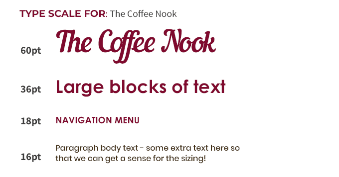
Typescale
The typescale needed to further support the identity of The Coffee Nook. I wanted to find a main font that I could use with the logo that would be distinct and unique. I found that with the font Nautilus Pompilius on fontsquirrel.com. This would be perfect for the logo, but I wanted something that would be easier to read for headings, navigation, and body text. For those, I found serif fonts that were clean but bold to support the style of the display font used in the logo. The additional fonts I chose were Century Gothic Bold for headings and navigation along with Poppins Medium for the body text.
Logo
With the typescale and color scheme in place, I could design a logo for The Coffee Nook. My final design used the display font in the main color from my color scheme. To better drive home the coffee shop feel and a sense of connection, I replaced the 'o' in Coffee with overlapping coffee mug rings. This allowed me to bring in another color and add another visual element to the logo.
Icons
In addition to the logo, The Coffee Nook wanted an icon pair that they could use to call attention to their menu and other product offerings. I wanted to incorporate the browns from the color scheme and keep the icons simple and easy to recognize. The final design for the icons are a coffee mug and coffee bag with a coffee bean icon to better identify the type of products being offered.
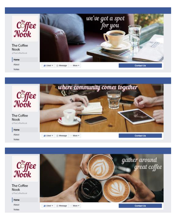
Social Banners
Promoting a new coffee shop is key for awareness in the community. In today's digital age, the best way to become known is through social media. I created several social media headers that would convey the warmth and idea of gathering at The Coffee Nook. These can help new visitors on their social media page get a sense of the atmosphere and offerings of a new place.
Providing several different options will allow The Coffee Nook to change out their banner to keep things fresh for repeat visitors. It also helps set a tone for future social posts, banners, and ads to keep the brand identity consistent.
Style Guide
All of the above brand identity elements were brought together in one cohesive Brand Style Guide for The Coffee Nook. The style guide gives an overview of the brand by stating its mission statement along with all the elements needed to keep their overall look and feel consistent. The style guide itself follows the same typescale and color scheme to further implement the brand identity. Going forward, The Coffee Nook can use this style guide for marketing, merchandise, and more to ensure that the appropriate colors, fonts, and overall feel are being achieved.
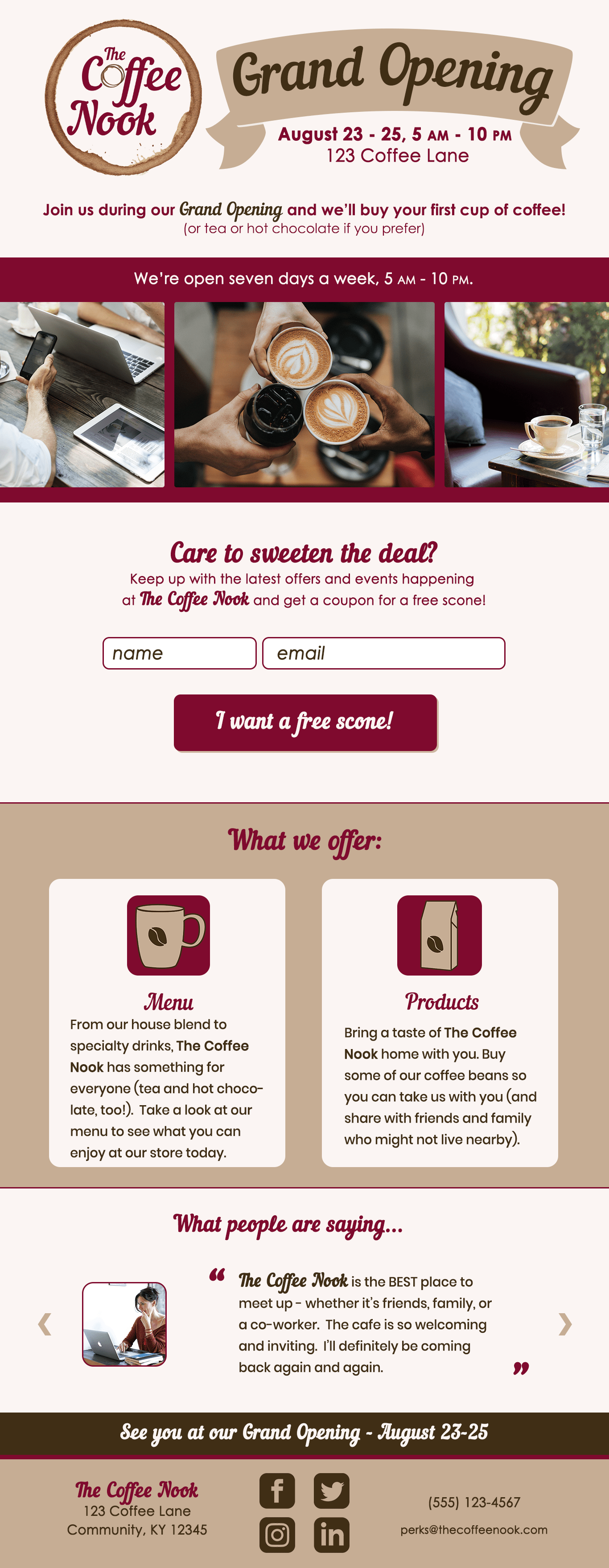
Landing Page
The final element for The Coffee Nook was creating a landing page design to let potential customers know about their upcoming Grand Opening event and sign up for their newsletter so they could be kept up to date with the latest happenings.
I started by assessing the most important elements (notify about the grand opening, include some imagery, a form for email signup, brief description of menu & products, testimonials, and contact information with social links). I designed a wireframe and added the color scheme, typescale, and images from the style guide. From there I gathered feedback from others and made adjustments to the design based on their input.