Dorothy DeLong Case Study
Project Goals
This was a concept design project for Dorothy DeLong, a photographer wanting to showcase her work on a personalized website. She wanted something that would highlight her photographs and encourage both galleries and magazines to contact her about using her work in exhibitions and publications. It also would allow her to reach a wider audience. Rather than being restricted to sending physical copies of her work, she could direct contacts to view her work online.
Dorothy wanted her site to include the following elements:
- artist statement
- photo of Dorothy
- quote about Dorothy's mission
- site navigation
- Dorothy's logo & full name
- 4 samples of Dorothy's work (with room to add more later)
- contact information
- social media links
Wireframe
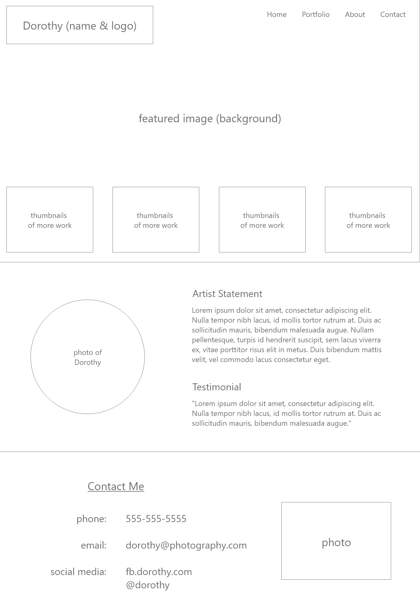
After assessing the different elements required for the design, I sketched a rough wireframe on paper. A paper sketch is a quick, easy way to assess the grouping of information and see if adjustments are needed.
The next step was to recreate the paper wireframe digitally to work with a grid and give a basic outline to the website. A wireframe is a simple guide - it doesn't use images, colors, or fonts. Oftentimes the text is filler as well, but it is enough to get an overall idea of the site layout. This final wireframe shows three distinct sections for Dorothy's website - the portfolio section, a section about Dorothy, and a contact section. I chose to include photos in the about and contact sections to highlight her work throughout the entire site.
Color Scheme and Typescale
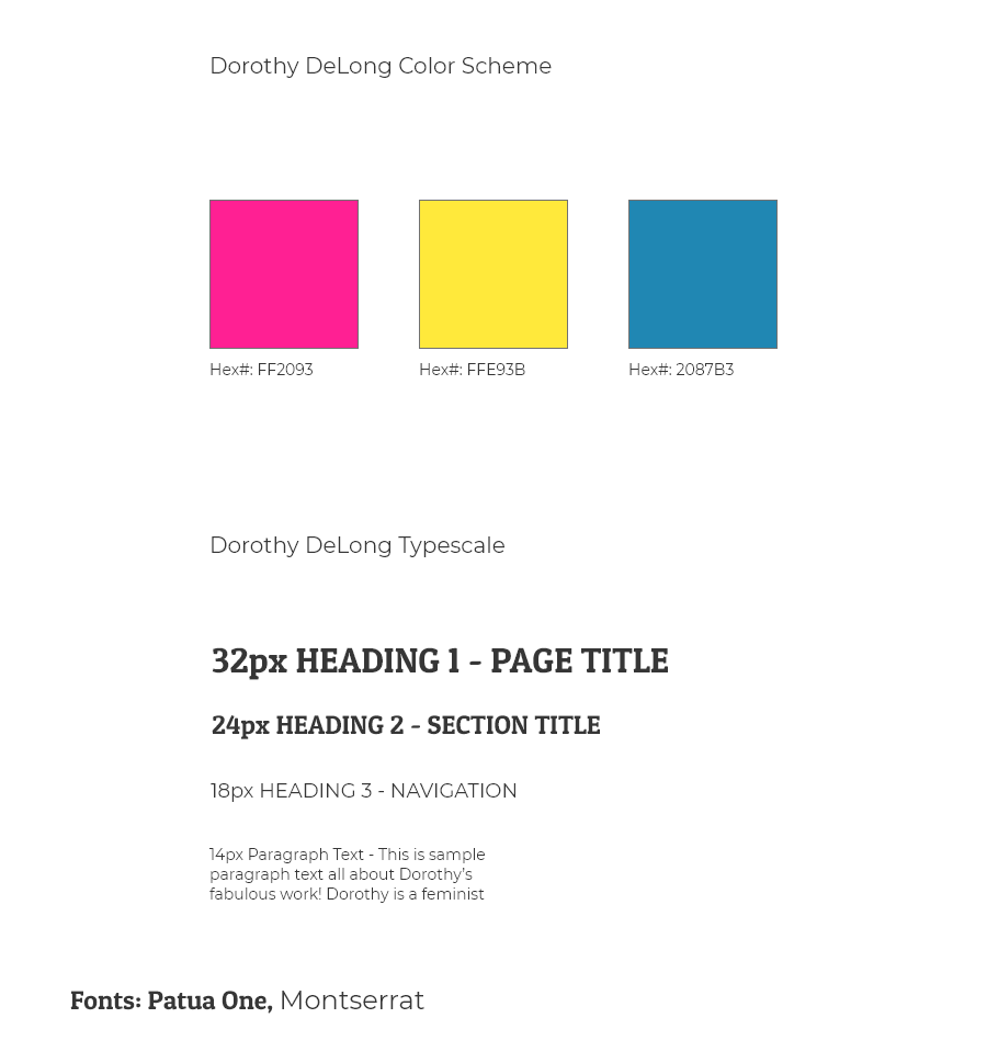
After laying out the elements of the website in the wireframe, I focused on the look of the website. Looking over the photos, I decided to pull out some bold colors from her work. The final color scheme is similar to colors used in printing - cyan, magenta, yellow. For the text, I settled on a dark charcoal gray that wouldn't be quite as harsh as a true black.
To reflect the strength in her photographs, I chose a bold display font for the headings. I complemented it with an easy to read sans serif font to use for the body text. The heading font is Patua One and the text for the body is Montserrat, both by Google Fonts.
Look and Feel
With the color scheme and typescale decided, I applied these to the wireframe created earlier. Even without adding any images, having the colors and fonts allowed me to get a better idea of the overall look of the website. I played around with different elements to make the navigation and headings stand out on the page.
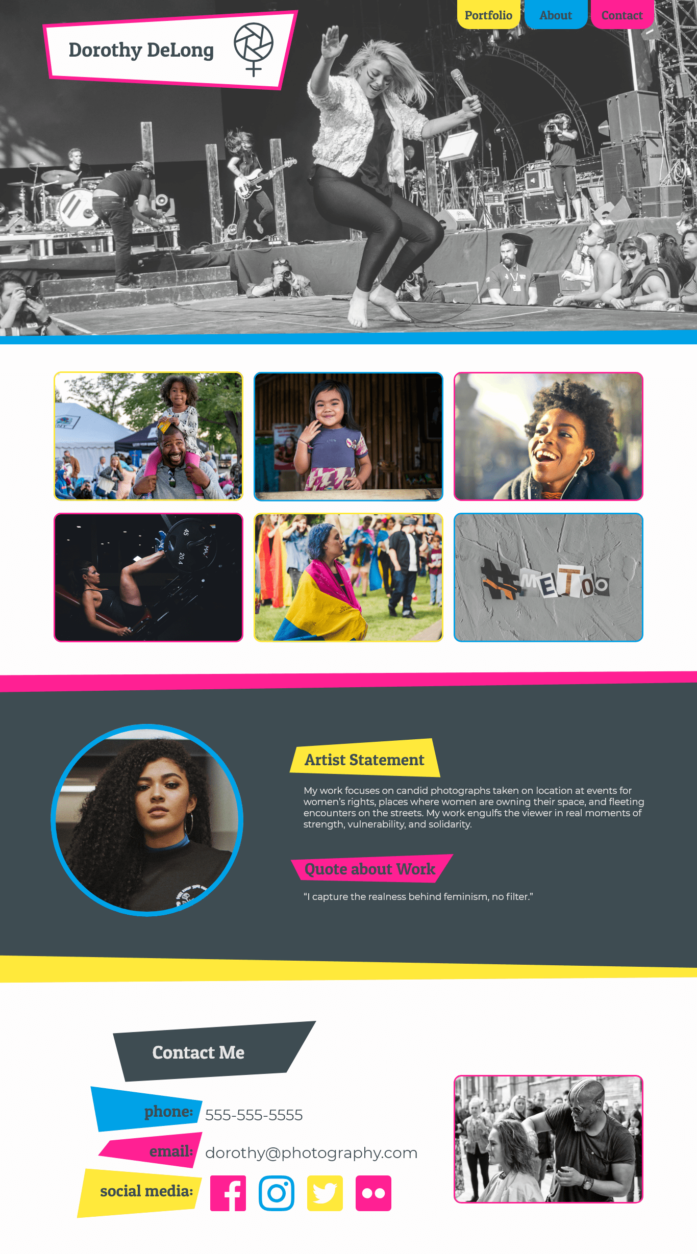
Since I wanted Dorothy's photographs to be front and center, I wanted to use one for a hero image to command attention when anyone first visits the site. Then, I wanted to provide options to view other photographs by including thumbnails below the hero image. To make elements stand out on top of the images, I utilized the three colors from the color scheme to create borders and bold shapes for the background of the navigation links and headings throughout the site.
Add Images
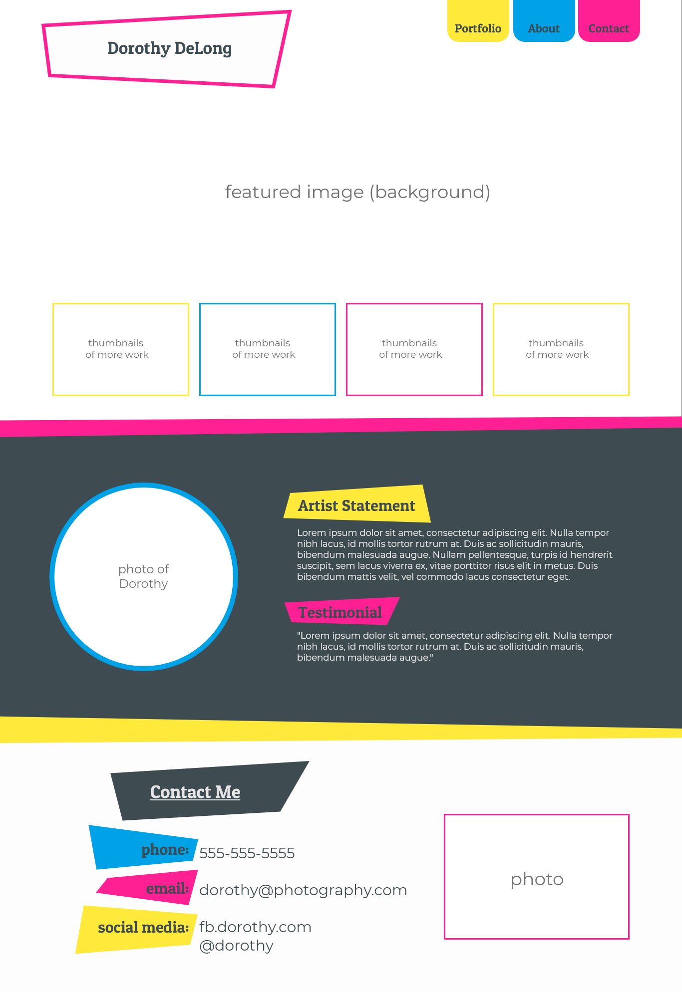
To make sure that the color scheme, typescale, and layout still worked well together, I needed to add Dorothy's images into the wireframe. I chose one of the photographs that gave a great sense of movement but also was monotone to be the hero image. Since it was grayscale, the navigation and logo would stand out.
Seeing the images on the page allowed me to review the layout and ensure that the website had all the necessary elements. The color scheme also brought a vibrant energy without pulling too much attention away from the photographs themselves. In fact, seeing the images in tandem with the color scheme further enforced that the colors were pulled out of the photographs themselves.
Final Design
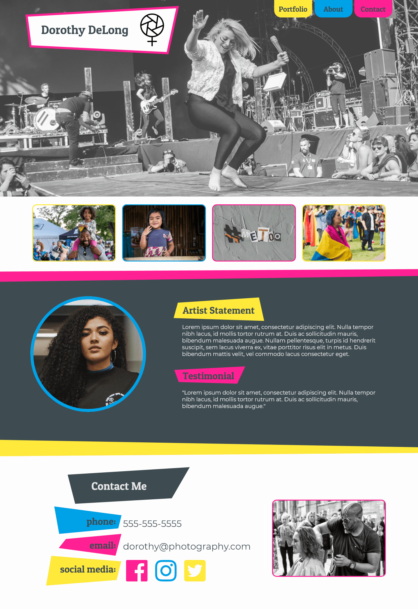
With the images added, I could present the design to Dorothy for feedback. At that time, she'd decided that she wanted to include not just four, but six, photographs on the site. Given the previous layout, there wasn't room to add two more photographs without making the thumbnails fairly small. Instead, I chose to increase the size of the thumbnails and create a gallery with multiple rows of images. This also allows Dorothy to add more photographs in the future and continue increasing her gallery of work.
As an additional personal challenge, I coded my design for Dorothy's site.